There’s one outcome the past few years that we can’t deny: our lives moved online. We’re working online, exercising online, socializing online, going to the doctor online - the list goes on. But what impact has this had?
In many circumstances, it means more companies need to verify that people really are who they say they are online. But often, this need is passed on as a burden to their everyday customers. There are more and more hoops for them to jump through: two-factor authentication, one-time passwords, text codes, email codes, codes that expire. None of them offer a great experience.
But to be secure as a business, you still need to verify your customers. Recognizing them is important for building good relationships.
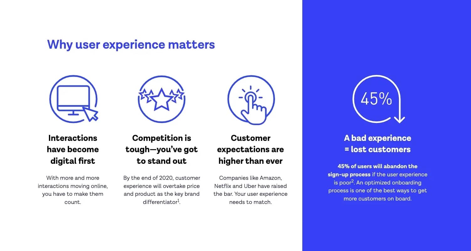
57% answered ‘ease of accessing my accounts’, compared to 19% ‘understanding my interests’.

As a provider of identity verification, we recognize that verification is just one part of your customer’s experience and interaction with you. Most of the time, proving their identity is not your customer’s sole purpose. It’s simply a necessary step before they can carry on with what they came to you to do - whether that’s accessing their money online, making a purchase, booking an appointment, checking in etc.
So rather than creating an extra burden, we’re focused on how we can make this moment of verification better, for both you and your customer. Below we run through seven tips to help you achieve this.
-
Fewer clicks doesn’t always mean better UX
Onboarding is an important part of your user experience. Your goal is to keep people engaged, increase conversion and avoid drop off. Adding identity verification creates an extra step. So to reduce friction, it can be tempting to shorten the process by reducing the overall number of clicks.
But identity verification is an important step - and it’s crucial that a) people understand why they are going through the process and b) ensure the process is explained clearly and offers guidance so that people only have to do it once.
So rather than focusing on reducing the number of clicks, you should focus on being as helpful as possible. Explain both the why and the how, but at the right moments: don’t overload users with information all in one go. We find that short instructions and transparent guidance achieves the right balance.
-
Get smart about waiting times
It’s important to verify your users quickly. But even a five-second wait can feel like a long time when you’re sat in front of a screen. And people hate waiting, particularly if they feel stuck. They want to have a sense of progress and a sense of control.
To give a real-world example, one airport found that people were complaining about the amount of time they had to wait before collecting their baggage. People were waiting for around 7 minutes, a time which the airport couldn’t change. However, the route passengers were taking from the plane to baggage reclaim only took 1 minute - leaving 6 minutes of passive waiting time. By changing the route, and making passengers walk for longer to get to their bags, complaints stopped.
The same applies in the online world. Give your customers something to do so they are actively waiting, like allowing people to continue browsing or exploring the app. Or if that’s not possible, let them know how long they’ll have to wait and notify them when they can come back.
-
Get users at the right time
In some industries, for example financial services, identity verification is a legal requirement. You have to fulfill KYC obligations and take the necessary steps to verify your customers. However, where you add identity verification in your flow can make all the difference.
-
Friction can be good
It’s true that adding identity verification creates an extra step in your flow. And there’s the perception that adding extra steps creates friction. But sometimes, friction has its benefits.
For example, a few years ago Wells Fargo added an eye-scanning feature to their app. The process worked well - for their customers, it felt like it worked too well. The process was so fast that users began to doubt it and worried that anyone might get into their account. So the designers added an artificial waiting time to give users assurance that verification was happening in the background.
So in some instances, adding extra measures like identity verification, helps to build trust in the product and its security.
-
Consider identity verification to add value
This in particular applies to industries where a user wouldn’t initially expect to do identity verification, such as retail, sharing marketplaces and gaming. But it creates added benefits for both you and your customers in this new digital world by adding trust value, as long as it’s easy and your customers know why it’s benefiting them.
For example, no one likes filling in online forms when they sign up to a new service. Instead, with our Autofill feature, all customers need to do is take a photo of their ID and forms will pre-populate with their information. It saves them time and provides you with a photo of their ID which can be used for document verification.
From there it’s only a case of asking them for a Selfie to add another layer of trust, biometric verification. The advantage is that once you’ve established that person’s identity, they can then use their biometrics to easily re-access their account if they’re ever locked out.
-
Don’t forget about the unhappy path
The unhappy path is what happens when things go wrong. What happens to your customers who don’t make it through the sign-up process, or fail their identity verification check?
Luckily, this is the minority of customers. However, that often means the experience for these customers is deprioritized. But the when things go wrong moment is actually the most emotional, most impactful situation your customers experience. And it’s the one people remember.

Participant responses when the ‘happy path breaks’, end-user research insights, Q3 2020
One example of an unhappy path is a bank whose customers were locked out of their accounts. To get back in they had to:
-
Physically go to an ATM machine
-
Withdraw a random amount of money
-
Then deposit a random amount of money
-
Get in touch with the bank by ringing customer services
-
Quote the two numbers to become ‘verified’ and get back into their account
This multi-step process is poor on many levels: it’s inconvenient (users have to physically visit an ATM), it puts a lot of pressure on the user, and it’s not secure. While an extreme example, it highlights that you should make the unhappy path as simple and straightforward as the happy path, to minimize frustration and anger for your customers.
We only want people to go through our identity verification flow once. This is why our Smart Capture SDK is designed to provide feedback to users in the moment to help them capture good quality images that are more likely to pass.
If customers do fail the check, get them back on track by providing granular feedback. What failed and why, and what are the next steps they need to take?
7. Design for everyone
Finally, we believe that everyone should have access to the products and services they want. That’s why we’ve taken steps to make our identity verification accessible.
The purpose of designing for accessibility is to improve the usability and usefulness of digital services. A great example of this is the electric toothbrush - it was originally designed for people with mobility issues but is now a popular alternative to normal toothbrushes. Products designed with accessibility in mind are often better for everyone.
We surveyed 5,000 people to see what they expect from digital experiences.


